Helping an established brand grow
When I joined FFBT as their Media Designer, I joined a company that had already been developing its brand for nearly 135 years. I took their tradition-based brand and propelled it into the modern era.
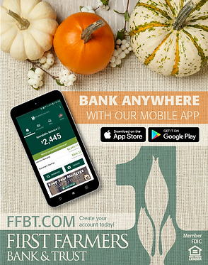
About a third of my day at FFBT was spent designing print and digital advertisements. This was my first foray into print advertising, but I was up to the challenge.
I quickly learned that Advertising a bank is a bit different than advertising a physical product. I couldn't simply show the viewer a pair of shoes or new purse and say"Isn't that neat?"
It was my job to convince customers that they could trust us to keep their hard-earned money safe. Not only that, but they needed to know that we were a better choice than every other bank out there.


As you can see, I advertised a wide variety of products and services over many different locations. This kept me on my toes, as I wasn't allowed to settle into recycling one design template.
I always take the specific season and situation into account when designing. For example, I'm far more likely to use red and blue in the summer, while orange and yellow often appear in the Fall.
I utilized stock photos to create the majority of my ads. Once I found the perfect image, it all came down to positioning the graphic elements in an appealing, yet legible arrangement.

Episode 1: Log Bench
To ramp up customer engagement, we developed a video series for Facebook called "Growing Home."
Once a month we built a small DIY project and gave it away to one lucky winner. It was my job to edit these videos.

Episode 9: Fall Wreath
Nearly a year later, these videos have gathered quite a following, with up to 2,000 views per episode, making them some of the most viewed pieces of content on FFBT's Facebook page.
Although most of my ads went onto billboards, into magazines, and on the internet, I liked to look around at our various locations for interesting and unique advertising opportunities.
James Dean grew up and was buried in Fairmount, Indiana. Although our Fairmount branch is always heavily involved in the annual James Dean Festivital, we were missing the chance to link a celebrity to our brand.
So, I reached out to CMG Worldwide, secured the rights to his image, and designed a sign that we would be proud to hang on our building for years to come.


The first design I created looked good:
James dean standing with our logo in his classic leather jacket. I decided, however, to find an image that didn't feature a cigarette.
Originally, I intended to keep it classic with a black and white design, but after asking around for feedback and giving it a try, I realized that colorizing the photo made it really come to life.
Finally, after weeks of discussion, the finished sign was prominently displayed on the brick wall of our Fairmount branch. Just in time for the James Dean Festival!


Updating and improving a website
FFBT had a functional website, but as with everything, there was room for improvement. Over the course of a year and a half, I gave FFBT.COM new life by improving the overall look of the site and making it more user-friendly.
Before:

When I joined the bank, the Home Page of the site wasn't much to look at. It was technically functional, but it lacked creativity and visual appeal.
Aside from the banner ad and the online banking login, there wasn't much to interact with on the homepage.
After:

By adding some nice background elements, I gave the home page a much needed makeover.
I added three interactive sections halfway down page, each with links to our social media, original content, or news posts.
Before:
After:

The mobile version of the home page suffered from a major issue. The Mobile Banking Login Form took up the majority of the screen, forcing the user to scroll down to see our updates and new product offers.
My redesign solved this issue by concealing the login form until the user clicks the Login button in the corner of the screen.
To help users find the new location of the login form, I drew attention to the login button with a simple radial burst animation around the button.


After I made these changes to the home page, we immediately saw a rise in the number of events
(button and link clicks) on the site.
